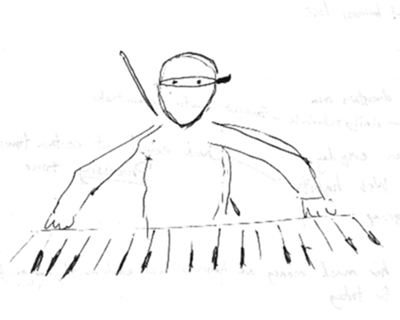
As I play around with PianoNinja, I’ve noticed so far that it’s fairly easy to get out of sync with the notes that I’m supposed to be playing. I tend to speed up when playing slowly, for example. (You might have noticed this in the last video I posted). Part of the problem is that I don’t have any strong cues as to where the beat falls. In games like Dance Dance Revolution, there’s a very strong beat—you simply dance to the music that you hear. Ultimately, I think PianoNinja will need auditory cues as well, whether as simple as a metronome sound or as complex as a full accompaniment. (That would make it a lot more fun too.)
But before I add any auditory hints, I want to see how far purely visual cues can get me. Of course, I’ve made the decision to go with Klavarskribo, so the question as to what visual cues to use has largely already been answered for me. (Basically, use solid and dotted bar lines to indicate the primary and secondary beats, respectively.) But what Klavarskribo doesn’t answer is how to display the notes once they reach the point where they’re supposed to be played.
The simplest approach would be to just keep scrolling the manuscript right off the screen, just as if it was a roll of sheet music continuing to unwind. In other words, apart from the scrolling movement, the display would be purely static. You’d know when to play the notes only according to when they cross a given (horizontal) line, but then they’d keep on scrolling off the screen and out of sight. In that case, perhaps the most natural place for that line would be the middle of the screen rather than the top. That way, you’d be able to see the notes come and go rather than immediately scroll off the screen at the top.
I’ve decided to take a more dynamic approach, placing that line at the top of the screen and representing it with a picture of a piano keyboard, so that, for one thing, the relationship between the notation and the piano keyboard is immediately obvious (I hope). The dynamic aspect is that the visible note then freezes and remains stationary on its corresponding piano key for the duration that it’s supposed to be played, while all along the rest of the music continues to scroll upward. Early on, I was experimenting with a grayscale fade-out approach for representing the decay of the note’s sound, but I found that keeping it solid and stationary and then suddenly making it disappear worked nicely—especially when followed immediately by another note in the same hand. The combination of the new note stopping in its tracks and the old note vanishing in the same instant creates a certain visceral perception of the rhythm. At least that’s my suspicion and hope; I haven’t fully put it to the test. Right now, the durations are all hard-coded to the length of one beat, which doesn’t fit well with the Chopin Waltz I’ve been using in my demos. The notes all linger far too long, giving a molasses-like visual effect which doesn’t help you feel the beat at all. So I think I’ll focus next on taking care of those note durations.
With this approach, the most “attack-like” movement that you see is when a note ends, not when it begins. What makes it work is the fact that the disappearance of one note often coincides with the attack of the next. For that reason, it may turn out to work well for some kinds of music, but not so well for others.
But now I’m just speculating. First I’ll get it to work correctly and try several pieces of music with it. If I still find it to be lacking, then maybe I’ll add some kind of “flash” to each note’s attack. I’m hoping that won’t be necessary though. I like the idea of a visually spare interface that still packs a punch—like Klavarskribo itself, and, I hope, like the new PianoNinja logo. 🙂


